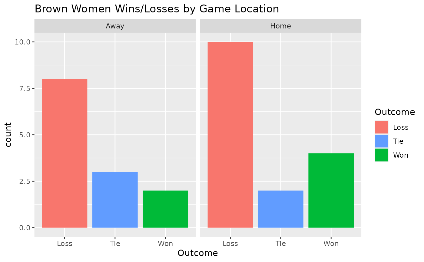
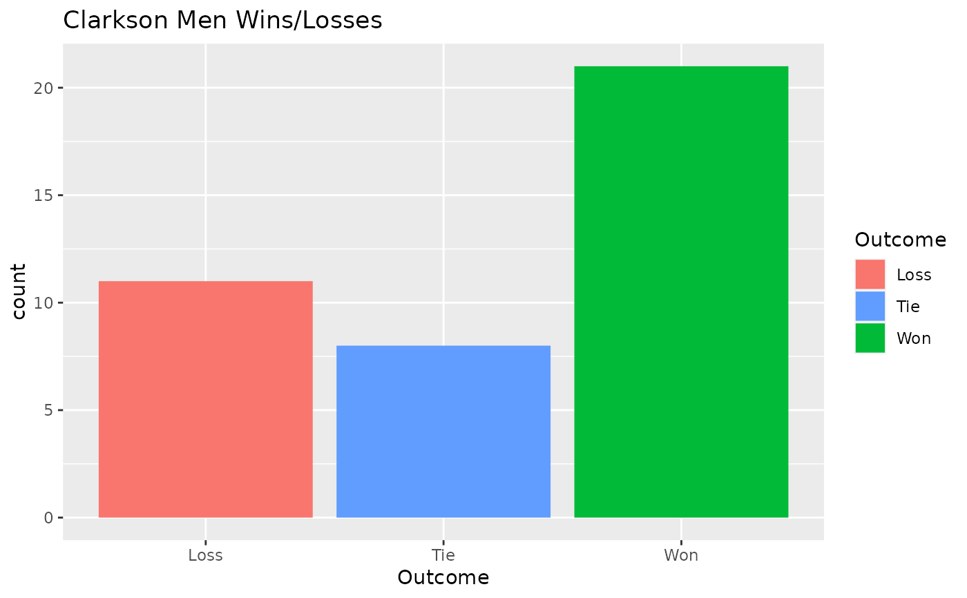
Produce a Win/Loss ggplot2 Bar Chart
winLossChart.RdCreates a ggplot2 bar chart object visualizing the wins and losses of a given ECAC team. Can be faceted by home/away.
winLossChart.RdCreates a ggplot2 bar chart object visualizing the wins and losses of a given ECAC team. Can be faceted by home/away.